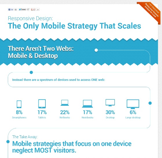
This responsive infographic about responsive design takes a new approach to the three available mobile avenues. Why does responsive design is the only mobile strategy that scales to address all devices? Try the responsive infographic, just resize your browser window or launch on your smartphone to see the infographic automatically transform to fit any screen size.
Sitefinity has produced the responsive infographic to show why it’s time to stop ignoring mobile. Many companies still have not managed to address the challenge that the mobile revolution brings. New devices launch seemingly every day, so mobile solutions must be nimble enough to keep pace.
When to use a specific mobile approach? This infographic would tell you why it’s time to stop ignoring mobile.
(Click on the Image For Full View)
 Source: sitefinity

