There is an enormous amount of articles on strategies describing how to build a successful brand. You can easily find them online. The majority of them stick to clear and intuitively understandable plan:
- Figure out what will you be dealing with.
- Determine your target auditorium and act according to your potential customer values
- Think of understandable and catchy moto
- Develop the logo that reflects your brand, and provokes your auditorium to consume your product or services
A logo is not the first thing, you think about when you try to develop a new brand, but keep in mind, that it’s important, especially during the past decades, when visual presentation of the product or brand is essential. It’s a common thing that you do not remember what exactly the company produces, but you have the visual footprint of the logo someplace deep in your brain. The good logo is imprinted almost on the level of your basic instincts, and, as a customer, you’ll choose the most visually familiar brand if you had no previous experience with it.
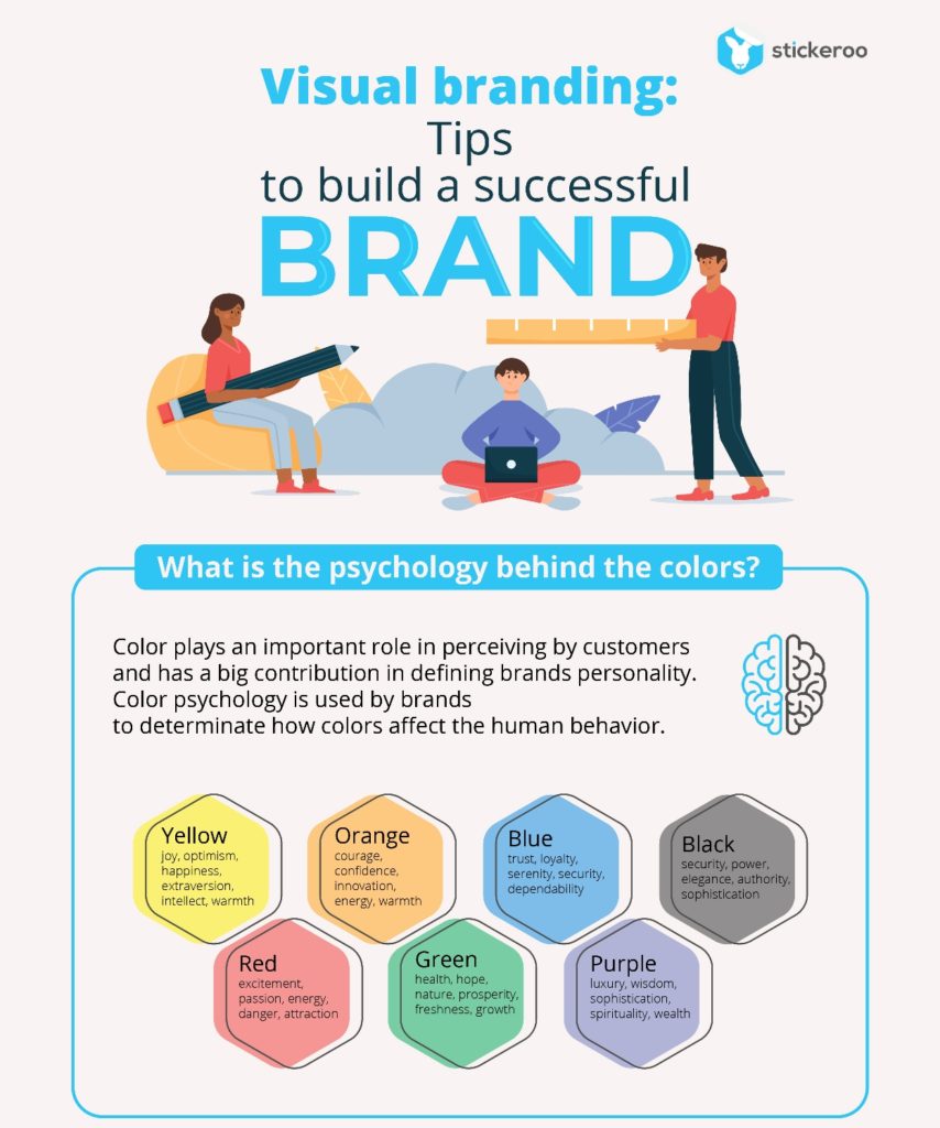
This is the reason why companies pay a lot of attention to colors and their combination while branding and rebranding their products and services. Every color provokes a certain type of action. Red is passion, aggression, and action. Dark blue for confidence and stability, light blue – is for relaxing. Yellow is for joy. Orange is for novelty and adventure. The color brings the mood and the first intuitive message from the brand. So, even before the customer would know the name of the product, they are prepared for a certain type of activity. And already know if they’ll take part or not. For more hints on applying color check the infographic by Stickeroo below:
(Click on the image for full view)


