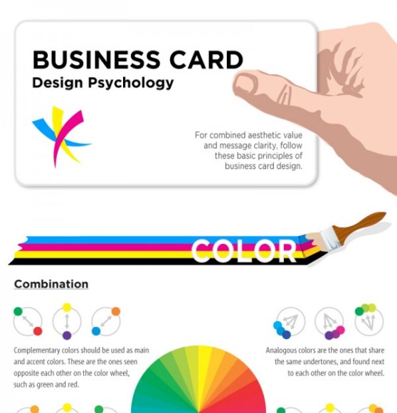
CardPrinting.us presents a helpful infographic the design psychology behind business cards. The basic principles mentioned include aesthetic value and message clarity. Three of the main factors of these principles are detailed in the infographic: color, text, and whitespace.
The color section describes the different combinations in the design color wheel, such as complementary, analogous, triad, and split complement. The different characters of each color are also depicted: yellow for youth and being positive, red for power and urgency, green for abundance and serenity, etc. The next section of the infographic is all about the text used in a business card. Readers will get to know about the different typeface personalities suited for specific business card designs. As well, the most popular font choices used are also featured in this section. The last section is all about the effective use of whitespace in a business card. It lists several traits of both good negative space and bad negative space.
(Click on the Image For Full View)
Source: cardprinting


